Pantone’s “Reflex Blue” is one of the popular, pure blue colors in the PMS system. It’s actually quite popular in corporate branding – and I’ve had 3 or 4 clients use it as their primary blue because it’s just that . . . pretty much straight up, pure blue. But it lacks one thing . . . the typical 3-4 digit PMS reference number like most of the other Pantone colors.
It recently threw off a client’s vendor, as their Package Printer’s new print management system required all of their PMS colors to be input with the numeric code only, so they got stuck when we sent over the Package Design artwork with “Reflex Blue” in the color palette.
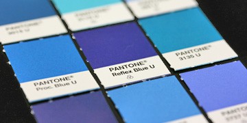
Why doesn’t it have a number? I’m not sure exactly, but it’s one of the few that only reference by name. If you look at the chart in full, you’ll see a handful of others, like “Rubine Red”
Here is Pantone’s only relevant link in their Help system:
But it only indirectly confirms that there is one (by calling it out by name) but not why or why there isn’t a number associated with it. It appears that the term is rolled over from a pigment used in printing ink manufacturing:
[callout font_size=”13px” style=”royalblue”]’Reflex blue’ is a common name for a certain blue pigment used in printing ink manufacturing. When the PANTONE MATCHING SYSTEM was conceived, the term PANTONEReflex Blue was coined to describe Pantone’s representation of the reflex blue pigment.[/callout]
Curiously, I’m not sure why they would NOT assign a 3-4 digit code to such a universally accepted system that otherwise uses numbers to assign colors. I guess maintaining name-only recognition trumps keeping with a standard numbering system.

PMS Color Chart showing two of only a small handful of PMS Colors that are not referenced by a number.
Other Color Space Equivalents
And while we’re at it, Reflex Blue translates to other color spaces too:
- Reflex Blue to CMYK: 100, 72, 0, 0
- Reflex Blue to RGB: 51, 51, 153
- Reflex Blue to HEX: #333399
Pantone had a basic color.set to begin with, without numbers
Reflex Blue is one of the primary mixing colors used to make other pms colors.